
A real greyhound bus advertising sign has a look that stops people cold. The running dog, the bold lettering, the clean utility of mid-century transport graphics – it all lands at once. But in this category, eye appeal alone is not enough. If you collect original advertising, you already know the hard part is not finding something that looks old. The hard part is finding something that is old, right, and worth owning.
Greyhound signs sit in a strong part of the market because they cross over several collecting lanes at once. Transportation collectors want them. Americana buyers want them. Interior designers and garage display buyers want them because the imagery reads fast and looks right on a wall. When the sign is original company-issued material, not a later decorator piece, it carries the kind of history that reproduction signs simply cannot fake.
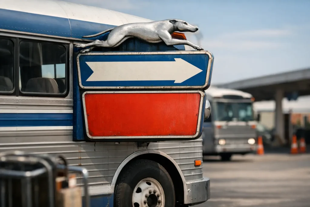
Why a greyhound bus advertising sign gets attention
Greyhound built one of the most recognizable brands in American travel. The name alone hits nostalgia, but the logo does most of the heavy lifting. That running greyhound was made for signs. It suggests speed, distance, and the optimism of roadside America in one clean image. Good advertising art matters in every category, and Greyhound had it.
That is a big reason original examples have held collector interest. A strong Greyhound piece does not just appeal to bus history buyers. It also fits gas and oil collections, travel and transport displays, dealership-style interiors, and commercial spaces that want authentic American visual history on the wall. It is versatile, but it still has identity. That combination helps.
It also depends on the format. Not every Greyhound sign is equal. A small counter card or paper insert can still be collectible, but most buyers are looking hardest at porcelain, tin, embossed metal, terminal signage, and larger display pieces with serious presence. Size, scarcity, and graphic impact all move the needle.
What makes an original Greyhound bus advertising sign valuable
Originality is the first filter. Without that, the rest of the discussion does not matter much. The market is full of made-up pieces, later fantasy signs, and modern decorative reproductions dressed up to look older than they are. Some are obvious. Some are not.
With a genuine piece, you want to see signs of correct age and manufacture, not artificial wear. Porcelain should have the right gloss, weight, edge chipping, and mounting hole wear for the period. Tin should show honest aging, not forced distressing done last year in a workshop. Lettering and graphics should match known brand styles, and construction should line up with how signs were actually made for bus depots, stations, ticket counters, or roadside use.
Rarity matters, but condition still drives the final number. A rare sign with major restoration, replaced metal, or questionable repaint can fall behind a cleaner example fast. On the other hand, some Greyhound pieces are scarce enough that collectors will accept heavy wear if the sign is unquestionably right. That is one of those areas where experience counts. There is no fixed rule that works across every sign.
Provenance helps too. If a sign came out of an old terminal, route office, travel agency, or long-held collection, that story matters. It does not replace physical inspection, but it adds confidence. The best pieces usually make sense from every angle – age, construction, wear, design, and where they came from.
Spotting trouble before you buy
If you are shopping for a greyhound bus advertising sign, caution is not paranoia. It is common sense. This is a category where buyers get burned because the graphics are attractive and the name is familiar.
One red flag is a sign that looks too perfect without a convincing reason. Original transport signs often saw hard use. They lived in stations, ticket windows, waiting rooms, maintenance areas, and exterior settings. That does not mean every real example should be rough, but a mint-looking piece needs to make sense. If it is a survivor from old stock or was never installed, fine. If not, ask harder questions.
Another problem is bad aging. Fresh scratches, fake rust patterns, and chips that look staged usually stand out when you have handled enough original material. Reproduction porcelain signs often miss on steel thickness, color tone, and firing quality. The image may be close, but the feel is off. The holes may be wrong. The backside may tell the story quickly.
Fantasy pieces are another issue. These are not always direct copies of known originals. Sometimes they are signs that were never made in period at all, but they use old-style graphics to create something that feels believable. To inexperienced buyers, those can be the most dangerous because there is no direct comparison in mind.
That is why specialist sellers matter. In a market like this, trust is worth money. If a dealer stands behind originality with real knowledge and a real guarantee, that is a different situation from buying a nice story and hoping for the best.
Porcelain, tin, and station pieces
The material changes the appeal. Porcelain Greyhound signs are usually the first thing serious sign collectors ask about because porcelain has durability, depth, and that unmistakable fired surface. Good porcelain signs have a presence on the wall that flat pieces often cannot match. They also tend to draw stronger money when the graphics are sharp and the condition is honest.
Tin signs can be excellent too, especially if they have strong color and embossing. They may be more approachable on price depending on rarity, but the better originals still have no shortage of demand. Tin often gives you a warmer, more lived-in surface, and that works well in period interiors.
Station and terminal pieces are a category of their own. Directional signs, ticket window signs, service notices, and branded location pieces can be extremely interesting because they tell you how the Greyhound system functioned, not just how it advertised. They are often less flashy than a classic logo sign, but they can be scarcer and more historically grounded.
Neon and illuminated pieces sit higher up the ladder when original. Those are not casual finds. If you come across a real period Greyhound illuminated sign with good bones, it deserves close attention. Condition and completeness become even more critical there, and restoration decisions can affect value in a big way.
Display value matters, but so does scale
A Greyhound sign has to work in the room as well as on paper. Collectors know this already, but newer buyers often focus too much on rarity and not enough on size, readability, and placement. A rare small piece with weak graphics may be historically solid but visually underwhelming. A larger sign with strong iconography can carry a whole wall.
That is why dimensions matter. A sign that reads across a garage, showroom, bar, or retail space will usually get more attention than one that disappears unless you stand directly in front of it. The running dog logo helps because it reads fast from a distance. When paired with bold white lettering on dark fields, it becomes one of those transport graphics that still works decades later.
Condition plays into display too. Some collectors want clean examples. Others want chips, scratches, and station wear because that is the point. Both approaches are valid. The mistake is pretending one type automatically beats the other. Sometimes a rough sign has far more life than a restored one.
Buying for collection, decor, or both
There is nothing wrong with buying a Greyhound sign because it looks great. The only problem is paying original-sign money for decorative material. If the sign is for a den, garage, office, restaurant, or showroom, it still makes sense to buy the real thing if budget allows. Original pieces hold the room differently. They also hold respect differently among collectors.
If you are buying for investment-grade collecting, be stricter. Look harder at authenticity, rarity, condition, and whether the sign represents the brand well. The best pieces usually check all four boxes. If you are buying mainly for display, you may accept more wear or a less famous format if the graphics are right and the sign has presence.
That split matters because not every buyer needs the same sign. Some want the cleanest porcelain example they can find. Others want a station-used survivor with scars and a story. Neither camp is wrong. The key is knowing which lane you are in before the money goes out.
At Road Relics, that is the conversation worth having before any sign changes hands. A real Greyhound piece should stand on its own – original surface, correct age, strong graphics, and no nonsense about what it is.
The best Greyhound signs still do what they were built to do. They catch your eye fast, they carry the road with them, and they remind you that American advertising was once made to last. Buy one that is right, and you will not have to explain why it matters when it is hanging on the wall.