History of the Ford Logo
History of the Ford Logo From 1903, 1907, 1917, 1927 to 1950. Over the years, the Ford logo has changed to show how much the company has grown and improved. The Ford logo is famous everywhere for its simple design. It started in 1903 when Henry Ford created the Ford Motor Company.
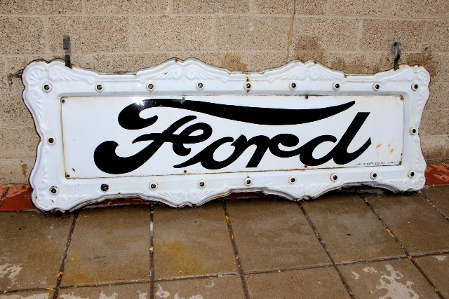
Ford 1917 Vintage neon Sign

This Ford sign is all original 2 sided and from 1917. This is by far the most rare ford dealership sign I have owned. its 2 sided, all original with a light bulb border.

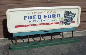
Old 1930s Ford Trucks art deco light up display Collectible Signs

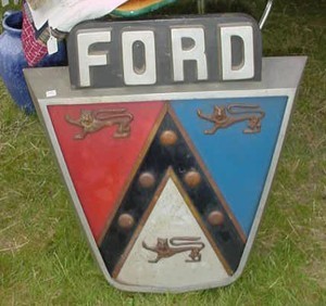
Vintage Signs Ford Crest 1950's

It is a small billboard and may have been used as a salesman sample from the 1950's

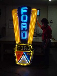
Ford arrow porcelain neon from the 1950's Neon sign

History of the Ford Logo
The first logo was a circle with fancy writing around it, but it didn’t last. In 1907, Ford made a new logo with the word “Ford” in fancy writing. This logo was called the “script with wings”. By 1912, Ford changed the logo again. This time, they put “Ford” inside an oval shape, which showed quality and reliability.
The modern Ford logo we know today came in 1927 with the Model A. It had a blue background and white “Ford” letters, showing trust and durability. Ford made small changes to the logo over the years. They made the blue darker in 1957 and updated the font to look more modern.
Ford’s logo shows their history and quality. It’s simple but powerful, like their cars. In 2003, Ford celebrated 100 years with a special logo.
