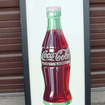
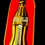
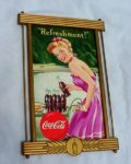
Vintage Coca Cola Logos
Coca Cola isn’t just a soda; it’s a global symbol. Founded in 1886 by Dr. John S. Pemberton, Coca Cola has evolved into an iconic brand recognised worldwide. Let’s talk about the history of vintage Coca Cola logos. See how the designs changed over the years and why they became so iconic. Perfect for fans and collectors.


The Birth of Coca Cola Logos
In its early days, Coca-Cola’s first logo was designed in 1887 by Frank M. Robinson. It featured the name “Coca-Cola”. It looked classy and set the style for the brand. After some days later Coca Cola gained popularity. By the early 1900s, the script became more elaborate, In the 1930s, Coca-Cola introduced there new great iconic red disc logo. This bold design featured the name in white against a red background. In the 60s, Coca-Cola introduced the dynamic wave logo, It showed the drink was refreshing and modern.
1980s to 2000s
In the 1980s, Coca Cola went back to a simple logo. The writing got cleaner but still looked classic. It was a hit with young people. And In the 2000s, Coca Cola mixed old logos into a new one. It celebrated the brand’s long history and stayed cool with customers.
Why Old Logos Matter
Old Coca Cola logos show how the brand has changed over time. They connect us to its history and remind us why it’s so popular.
