Old Pepsi Logo
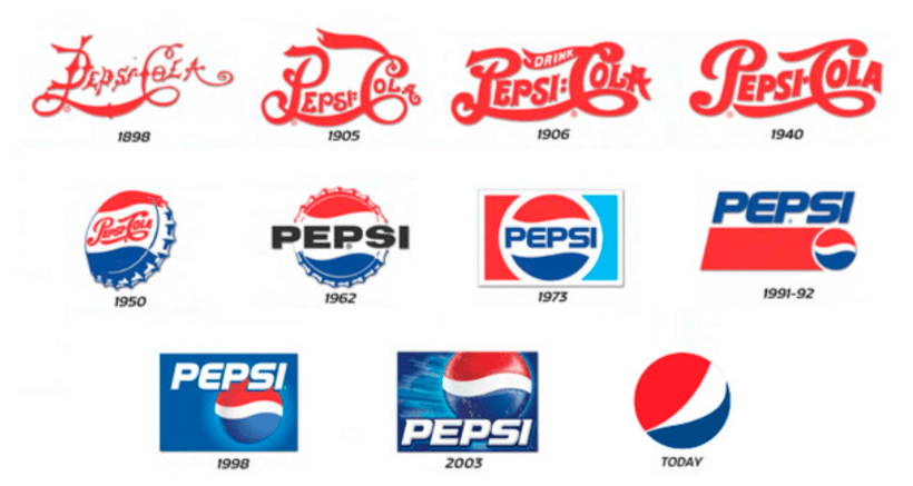
Pepsi has changed its logo over time to fit what people like and how they sell the drink. Take a journey through the fascinating history of the old Pepsi logo. Explore how they’ve evolved and become an iconic brand.
First, the logo had fancy writing and colours like red, white, and blue. In the middle of the 1900s, Pepsi made the logo simpler with stylish writing and added a picture of a bottle top. They used bright colours to attract younger customers. When Pepsi started selling all over the world, they changed the logo to look more modern and stay bright. Now, the logo is smooth with a globe, showing Pepsi is everywhere and cares about the Earth. Each change in Pepsi’s logo fits what people like and keeps the brand popular worldwide.

Our Old Pepsi Logo Collection


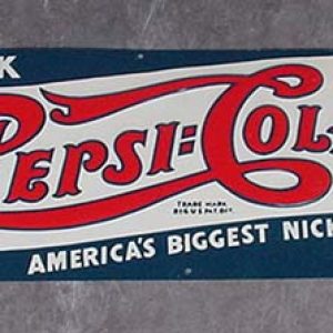
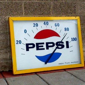
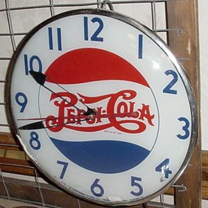
Some people love to collect old items. And different people collect vintage items for various reasons. Well, these Pepsi signs have a lot of value in the market. If you also have a hobby of collecting such old signs at your home for decoration and all, then you should visit. No matter whether you want to sell or purchase, this site will help you by giving the best possible price.
How Roadrelics help their customers?
The Roadrelics is the best trustable old sign shop for all those people who are looking to sell and purchase vintage items. They only purchase and sell the original vintage signs at the best affordable rates. Roadrelics offers 100% money-back guarantee.
Experience best quality service from Roadrelics:
Anyone can get their service at an affordable rate by visiting Roadrelics . Also has a huge collection of vintage neon signs, American folk art, old metal signs, and vintage gas and oil signs for sale. A lot of people visit and purchase quality service.

